Typographic Translation
A new edition of Ardengo Soffici’s Simultaneities
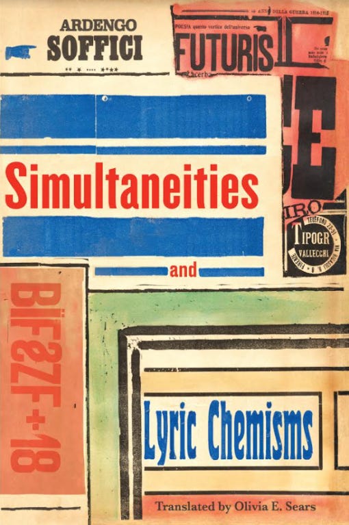
In the 1910s, the Italian poet and artist Ardengo Soffici created a handful of now iconic avant-garde typographic works. His aesthetic sensibility was closer to French Symbolist poetics and Cubist painting, but he gravitated towards innovative practices inspired by the manifestos of Italian Futurist Filippo Marinetti. The resulting two-part volume of poetry, BÏF§ZF+18=Simultaneità-Chimismi lyric, published in 1915, forms the basis of a recently issued facsimile edition from World Poetry Books in a new English translation by Olivia Sears. Thanks to research by Andrew Bourne and production by designers at Don’t Look Now the typographical scoring of these original works has been reproduced with scrupulously careful attention. Though not the first or only such facsimile, Simultaneities makes a compelling argument for accurate typographic rendering as part of the work of translation.
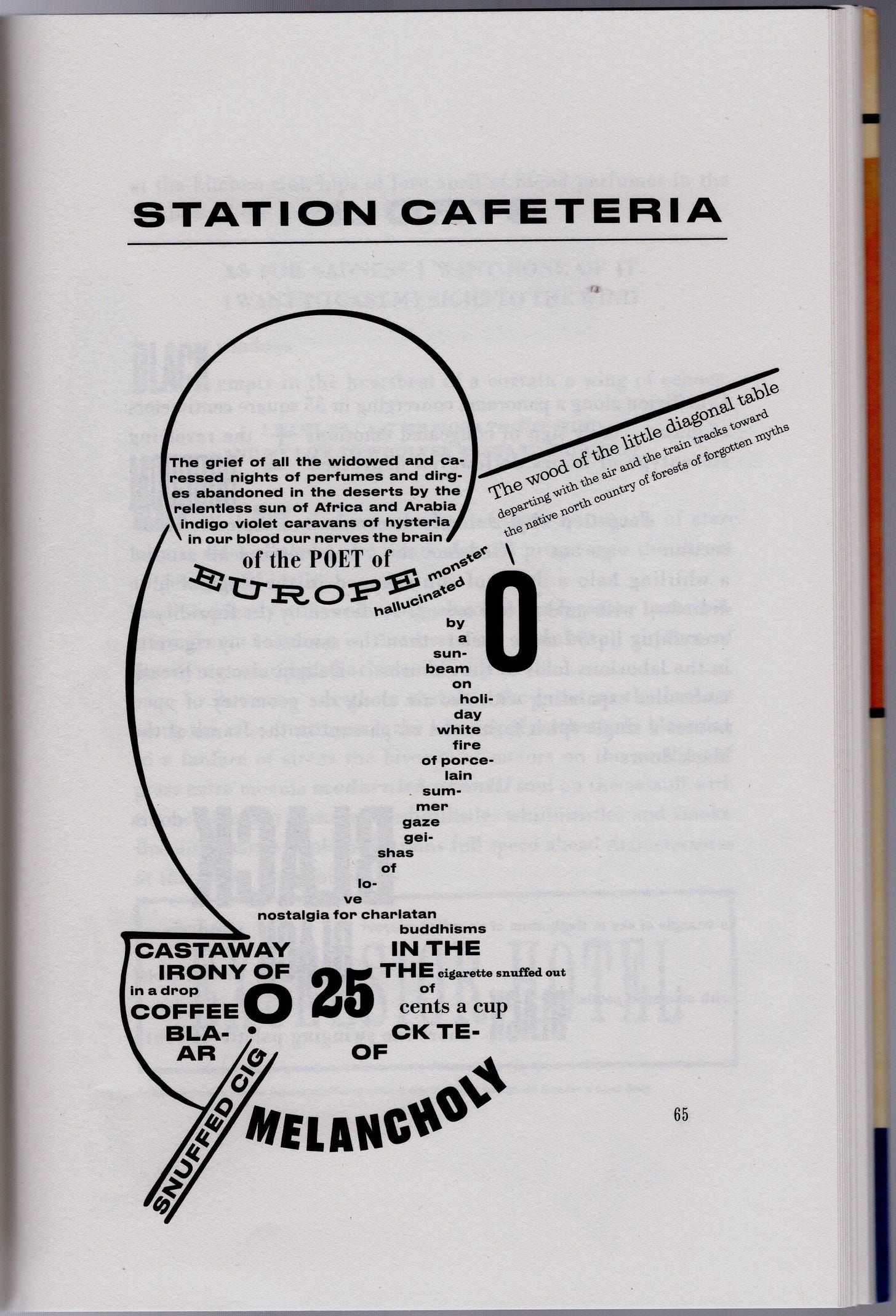
Typographic scoring is a performance of poetry on the page. We feel its reverberations and inflections as clearly as we experience sound in the performance a musical score. Rendering Soffici’s typographic pieces so accurately in this new translation demonstrates this principle. Dramatically. The poems read with graphic vibrancy, their letterforms and layouts still achieving a chaotic cacophony rife with splendid noise and strident rhythms.
The additional design decisions that went into the production also demonstrate the effect of material choices. The book’s soft-toned paper handles beautifully, and the earth-color palette of the cover is suggestive of early 20th century decorative arts and crafts traditions. Similar care shows in the editorial decisions. Details of the context and formation of Soffici’s work are clearly laid out in Olivia Sears’s “Introduction” and “Afterword” as well as the “Foreword” supplied by the eminent scholar-critic Marjorie Perloff.
Acts of translation involve many choices, and thoughtful reflection on these processes has produced much critical literature. Particularly in the case of poetry, the tension between formal features and meaning creates dilemmas at every turn—reproduce the sound patterns or emphasize the sense and/or imagery in a work? Translation, as we know, is an art as well as a craft, a task of dedication and commitment as well as compromise. The task of typo-translation involves the same debates and decisions about which features are essential to the poetic effect.
Among the incidental aspects of translations is the way they embody the historicity of language. 19th century versions of classical texts include vocabulary now too quaint to render an ancient author’s words legible to modern readers–even though they provide a lively snapshot of their own moment. Language, like fashion in clothing, is linked to cultural and temporal locations. Pants before zippers, stockings in the pre-spandex era, rows of buttons and whalebone, stays and ties—we recognize these features immediately as evocations of an era. Similarly, terms like “oft” and “eventide” or “thou” and “prithee” invoke another period, even if it is often a vague “ye olde” epoch, unspecified beyond being other than before this moment.
Vocabulary is one thing. Typography is another. Few readers fully recognized the distinctive hallmarks of 17th century type or know when and why various fonts were designed. The fonts of first editions or initial publication are generally ignored in updated editions. Typographic renderings are often anachronistic. For instance, letterforms designed for digital display are used to present works written before the industrial revolution. Anthologies are particularly egregious in this regard, stripping away the visual body of the text and putting it into whatever standard style has been adopted for that volume. These effects deracinate the original rendering, dulling the graphic features into a single monotone treatment.
If typographic education were more widespread, the presentation of an 18th century work in 20th century fonts would be glaring. But aside from the conspicuous actions—elimination of the long “s” for instance—most of this re-rendering goes unnoticed, or at least, unnoted. The work in this edition of Simultaneities is all the more remarkable for the typographic research to find fonts that matched the ones used in the first edition, or, in some passages, just scanning and reproducing the original letter combinations. Not every reader needs to be able to identify the source of a font or its designer any more than they need to be able to read the source language of a translation. What is significant is preservation of effect.
How extreme does the rendering have to be to change the text? Imagine Medea or Paradise Lost presented in Comic Sans or Peter Rabbit in black letter and the point about typographic scoring is glaringly evident. But most text faces are part of long and respectable lineages that go back to humanistic hands developed in the late Middle Ages in Europe and translated into metal in the early Renaissance. Palatino letters, originally from the skilled writing-master’s hand, have been redrawn, re-cast, and made available as a standard font in Word documents without too much damaging alteration. The reliable robustness of these enduring fonts makes them serviceable. Unless they are very mannered, they work.
But when typographic scoring was a part of their original composition that is marked by graphical inflection, then attention to the specifics matters. Among the most renowned work in this mode is Stéphane Mallarmé’s Un Coup de Dés. Initially published in 1897 in the British journal, Cosmopolis, in a version only partly faithful to the poet’s vision, it made an unprecedented statement. No work of poetry had ever engaged in such flamboyant behavior on the page.
Shaped poems, tracking back to Greek antiquity, had taken the form of funerary urns or fit into recognizable figures in a tradition that includes George Herbert’s Easter Wings (1633) and other famous examples. But these were shaped rather than typographically scored. They used text fonts whose letterforms belonged to the conventions of literary publication. Many literary games—acrostics and poems within poems marked by letter choices—extensively documented in Gabriel Peignot’s Amusements Philologiques (1842)—made use of visual qualities such as weight or size to organize their verses.
But the idea of typography as a graphic language, one whose specifics were indexical links to cultural domains, was only brought to the fore after Mallarmé and the early 20th century avant-garde started including a wide variety of fonts in their poetic compositions. Typographic innovation had exploded in the 19th century. Headlines screamed, posters made large-scale public statements on hoardings, advertisements clamored for attention in the streets and transportation hubs. The modest news sheets and signage of earlier centuries was replaced by industrial scale print production as steam-driven mechanized presses spewed forth printed materials at a rate exponentially greater than at any earlier time. The competition for eyeballs spurred the creation of whole new families of type—slab serif Egyptians, sans serif letterforms in exaggerated weights of thinness, boldness, fatness and elongation, pictorial initials and floriated ones, robust fonts and script types so elaborate they resembled the trail of ice skates on the surface of a frozen pond. A glance through the typographic inventory advertised to the printing trade boggles the mind. From the elegant single specimen sheets of Caslon and Baskerville in the 18th century to the inches-thick ATF (American Typefounders Association) catalogue at the beginning of the 20th century, the scale shifts from a handful of variants to thousands of typefaces in every imaginable size, shape, and weight. Mechanical means enabled this proliferation, with pantographic devices scaling fonts up and down, but commerce drove the variation in designs.
The awareness of commercial letterforms in 19th century public perception made for nuanced differentiation between literary work and journalism, fine editions and popular press, publicity and erudite editions. For instance, typographic codes were used to distinguish masculine newspapers (grey, bland, and serious) from those appealing to female readers (with lots of distracting variety appealing to their presumably short attention span). The typology of printed work established codes of decorum and behavior. Tone of voice and mode of address are marked in the way a text appears on a page politely or flaunting its bid for attention.
This is the context in which the avant-garde Futurist and Dada poets were working. Soffici participated in the founding of the important journal Lacerba in 1913, where his essay exploring “plastic Futurism” appeared demonstrate his commitment to exploring principles Marinetti laid out in the “Technical Manifesto of Futurist Literature” in 1912 as well as the later essays, “Destruction of Syntax—Untrammeled Imagination-Words in Liberty.” These offered explicit instructions on “Free expressive orthography” and a “Typographical Revolution.”
The Futurist and Dada poets raided the typography cases, taking advantage of every flavor of antique and modern, script and wood block letter forms. But few poets had the visual skill or imagination to execute such works. No book-length compositions managed this feat except the 1914 Zang Tuum Tumb that Marinetti authored, with its visual and verbal depiction of a battle in Adrianopoli. Among the handful of typographic works that are emblematic of the Futurist sensibility, Soffici’s are perhaps the most extensive and adventurous in their investigations of the principles espoused by the movement.
The specificity of these texts inheres in their direct engagement with the graphical language of commerce and advertising. The language of the “Lyric Chemisms” is full of logos, appropriated advertisements, promotion, publicity, and product brands for “TOT: digestible-cachets” or “Acqua Purgativa Naturale.” The poems reference public spaces—“Café,” “The Apollo,” or “Station Cafeteria.” Much of the language deals with these things and spaces, such as: “The wood of the little diagonal table”. But Soffici’s imagery is saturated with Symbolist sensuality. Shades of Arthur Rimbaud’s synesthesia also surface through the text, “Alphabets letters […] I breathe the rich odors of your secrets.” Soffici’s luscious and suggestive phrases are redolent of its colorful tones: “Coffee black tear of melancholy” and “indigo violet caravans of hysteria in our blood.” In “Via Nuova” he writes: “Your pink heels your honey curls shipwreck in this trickle of dirty dishwater” which leads in run-on richness through the “sublime […] piss” and a “rivulet bursting with rainbows” and the “headlights rushing from life to life” so immediately associated with Marinetti’s original Manifesto. The black slab serifs, condensed and elongated “modern” fonts, and letters picked for their resemblance to wood types all contribute to the visual character of the whole.
These are poems from the “modern” world—one now as vanished and remote as the Baroque and Classical realms had been for the Futurists. The excitement over electricity—still novel in its infiltration of urban life—radio, cinema, automobiles and cigarettes—is palpable. With their unruly combinations of display and text fonts, these graphic poems are the quintessence of Futurist chaotic energy. This splendid typo-translation does not just preserve their impact, it revives their verve and vitality.
World Poetry Books, https://www.worldpoetrybooks.com/product/simultaneities-lyric-chemisms/


