Torn Apart
Torn Apart
Punk, New Wave + the Graphic Aftermath 1976-1986; On view 25th June–8th September 2022, Pacific Design Center Design Gallery, Los Angeles

The shock of energy that spiked from the work exhibited in Torn Apart was graphic and visceral. Almost four decades after the emergence of Punk and New Wave subcultures, its screaming aggression still ripped through decorum. Nothing on the walls behaved according to rules and this was exhilarating. Selected by curator Michael Worthington from the extensive holdings of collector Andrew Krivine, the exhibit spanned a decade of graphic production from 1976 to 1986. Debates about the origins of punk fracture along various lines (New York vs. the UK, working class or middle-class kids in art school). But the consensus that it was an art movement as much as a musical one makes the case for the crucial role played by graphic style in creating its lasting identity. If safety pins and patches of shaved head were unmistakable fashion markers of punk, then torn paper collage and ransom-note typography were its graphic signs. Long before you read a punk flyer its target audience is clear. The semiotics of the subculture are unmistakable in an aggressive, up-yours, confrontational way.
The start date of the exhibit, 1976, predated the official inauguration of the Reagan-Thatcher era (Thatcher was head of the Conservative Party in Britain beginning in 1975, elected Prime Minster in 1979 a year before Reagan’s successful bid in the American presidential election). Punk’s attitudinal negativity, anarchism, with occasional offshoots of outright nihilism, has always seemed associated with their policies. A calculated downturn in commitment to the social welfare system and an official abandonment of the larger purpose of the common good in western industrialized societies (in favor of a hypocritical pull yourself up by the bootstraps ideology) heralded many changes whose long-term effects with which we are still burdened. The roots of their economic policies, self-serving political justifications, and hatching of pernicious neo-liberal agendas that resulted in de-funding of education, health-care, work training programs were hallmarks of the era. A deep disillusion had come with the demise of 1960s affluence and belief in radical politics. In the United States the end of the Vietnam War was accompanied by a major economic downturn. An edgy ennui had replaced the pop culture exuberance of the “swinging sixties.” By 1979, as that decade was ending, my friends and I had party whose punkish theme was “Kiss It Off.” Every individual invitation was decorated with an original blood-red lipstick smooch. We were angry, sensing the futility of mass protest and resistance in that era. That anger is clearly present in punk and new wave work.
Changes in mood and shifts in subculture attitudes are marked in punk graphics. But material conditions of design production had altered as well. As these graphics show, access to the means of print production changed what could be done in making visual work. The pale remains of duplicator art—mimeo and rexographic reproduction—that had helped proliferate alternative literary and community activities was rapidly supplemented by screen print, Xerox, and inexpensive photo-offset technologies. Offset printing required access to a press, and shop with copy camera, vacuum frame, plate maker and other industry equipment which was far too expensive for individuals to acquire. Whether black and white or four color, it demanded a significant financial investment in film, separations, and set-up costs that made it viable only in commercial work. Offset was prohibitive for fast-and-cheap graphic production in the hands of independent designers. But silk screen and Xerox had a DIY appeal. Screen printing relied on cut stencils, lacquer-based block out, squeegees and inks and a hinged frame that could be used in a home studio. The garage production echoed that of the bands using similar spaces for music. (Interesting to consider that digital technology was developing in a similar garage culture at the same time.)
Xerox was everyone’s favorite new plaything, cheap, direct, and photographic without the cost of film negatives or cameras. Technically, the first “plain paper copiers” were put on the market right in 1959, and throughout the 1960s they were in commercial production. But affordable models of copying machines, some made by competitors to Xerox, IBM and Kodak proliferated in the 1970s. No individual young artist bought a copier, but black and white copying was cheap, and even color images were dramatically less expensive than in offset reproduction. Xerox, the company, was already shifting into laser-jet and bit-map technologies for reproduction. Meanwhile, the standard office and copy-shop machines made it feasible for anyone to make their own multiples. Before that, it had been hard to print your own work—literary, graphic, musical or political–unless you had access to equipment and the skills to use it. Many schools—including such high-toned and non-vocational environments as Harvard—had letterpress print shops set up to create posters and announcements while art schools generally had screen printing capabilities in their studios (though actually some had been shut down after making posters in the 1960s and early 1970s for anti-war marches).
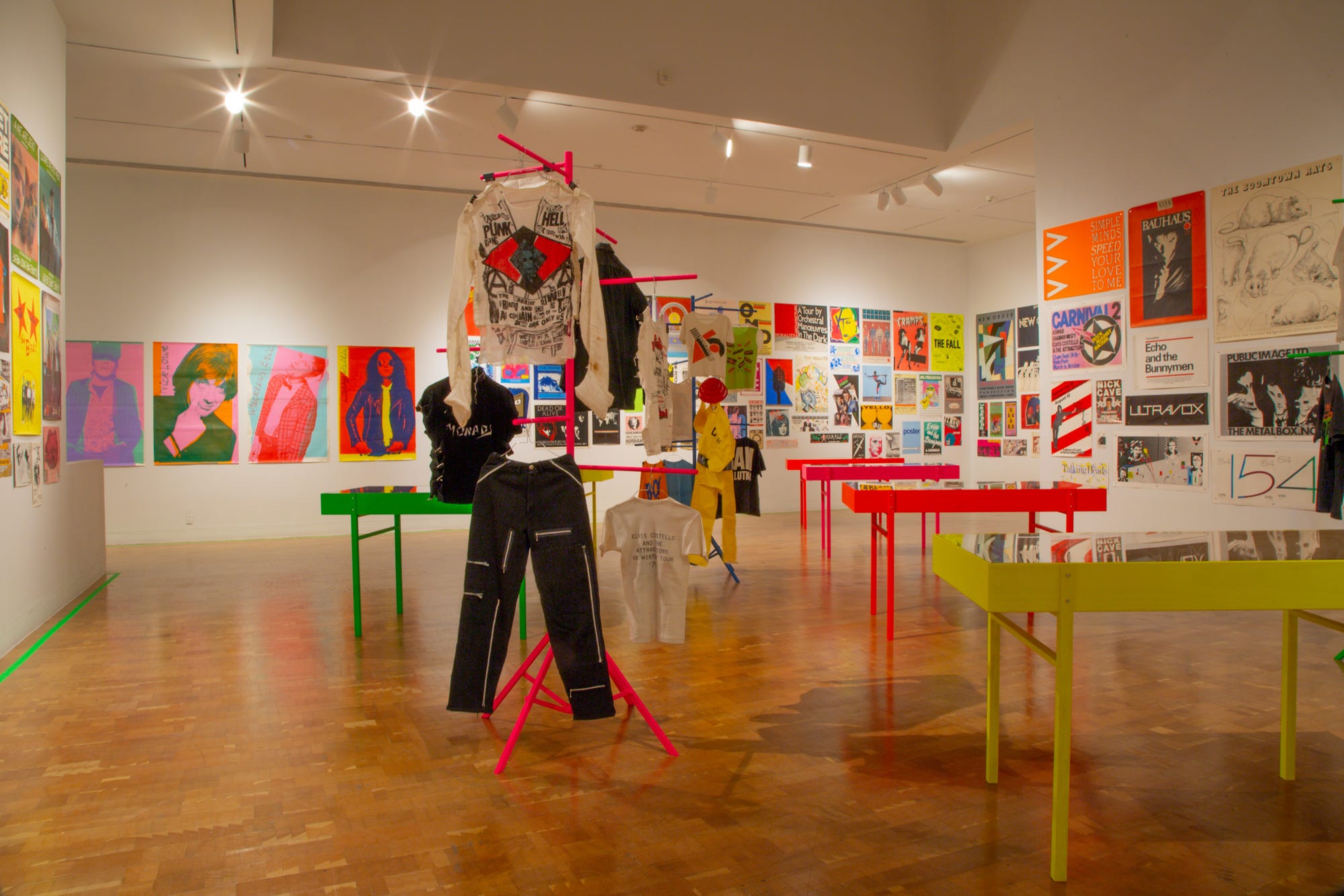
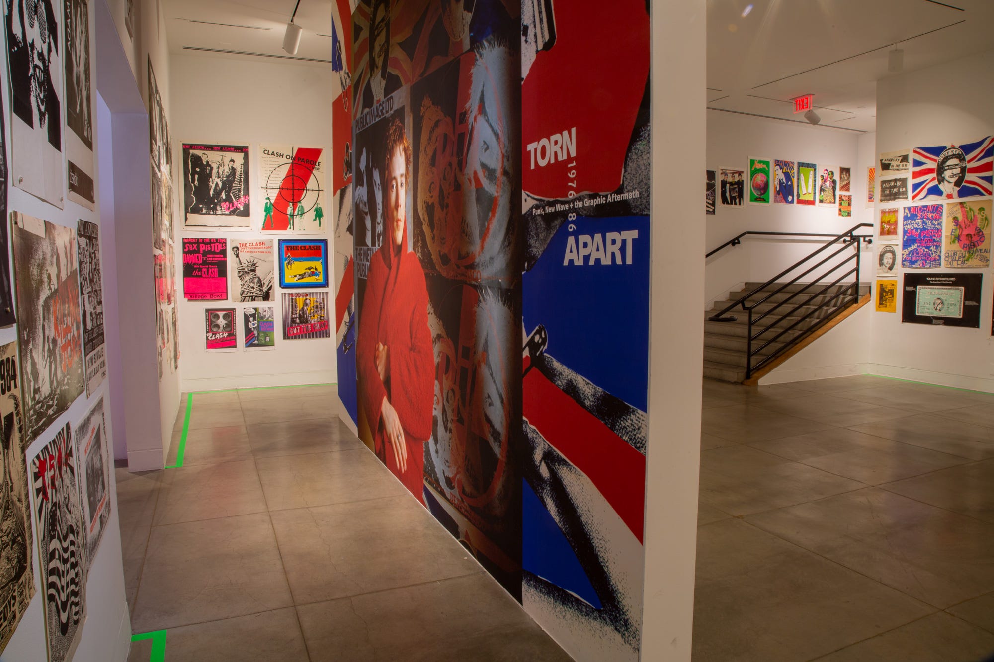
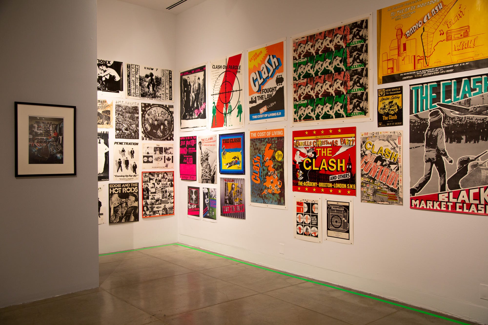
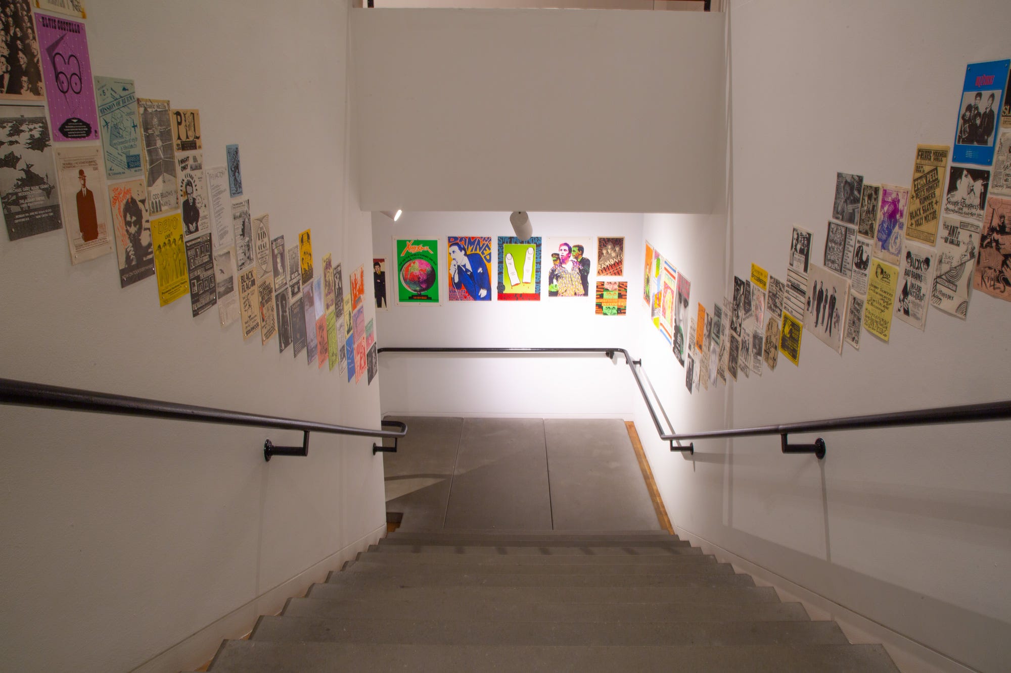
But to get a sense of this prolific output in a single exhibit takes curatorial dexterity. Worthington’s subtle but structured approach laid out the materials in thematic sections that took full advantage of the space. From the first entry walls to the full gallery display, up the stairs, and into an open room hung salon style the presentation was designed for optimal viewing. Clusters of color, silkscreen inks in day-glo and hot fluorescent tones, elegant rainbow gradients, works at small scale lining the staircase for close viewing, and larger work that holds up seen from across the room—all of these features were taking into account in the hanging. Some original continuous tone photographs on glossy paper offered direct glimpses of punk venues and celebrities with a nonchalant authenticity. The display cases held other gems—buttons and small work, objects that are the realia of archives, stuff that has the traces of use and experience, things rescued from the activities of an era to be offered to view in another. Hot and cool, loud and laid back, the posters ranged from a super-chic cool image of Patti Smith staring sphinx-like and implacable to small ink works splashed with barely legible splotches and scratchings. And yet, all of it fits together, each carefully chosen exemplar contributing to an oddly coherent cacophonous whole.
Some of this work isn’t “authored,” but Torn Apart offered a pantheon of punk and new wave designers as well as plenty of graphic production done by talented but not-always-professionally trained individuals. I wouldn’t venture to put forth a definitive list of these stars given my limited expertise, but Malcolm Garrett, Jon Savage and Linder Sterling, X3, Barney Bubbles, Peter Saville, Martin Kaye, and Alex Dowell, Jamie Reid, and John Angus would absolutely appear among them. The shift from professional control to DIY is apparent as a motif as well as in production. But various of these designers went on to distinguished high-profile careers with versatile and wide-ranging practices. For many, punk was a phase and a period, important but not the end-point of their careers.
As already noted, punk activity was often spawned in art schools, which provided a counter-culture refuge in the era of increasing conformity and self-repression that had followed 1960s pop radicalism. But in the 1970s, art schools did not provide any education in the history of graphic design (Philip Meggs’s A History of Graphic Design was first published in 1983, just to provide one reference point). As Worthington pointed out to me, many of these artists took their inspiration from the history of modern art and the avant-garde. Students in design classes learned typography, layout, technical and visual skills meant to provide them entrée into the advertising and entertainment industries. But every art student had to take art history. The constructivist work of El Lissitzky, De Stijl paintings of Theo van Doesburg and Piet Mondrian, collages of Italian Futurist Fortunato Depero, Germans Dadaists John Heartfield and Raoul Hausmann flashed on the screen. Visually gifted students immediately grasped the effectiveness of their approaches. Citation after citation appears as canonical images were appropriated with marked irreverence. The graphic plundering of sources, unreferenced, unacknowledged, was distorted to serve new messages.
Dada, Futurism, and Constructivism all make sense, however, as forerunners of punk just as Surrealism, Viennese Secession, and the Arts and Crafts movement had shown up in the psychedelic graphics of the 1960s. By the 1970s, everyone was pretty sick of flowing hair and swarming animate hallucinations, even if we all admired Victor Moscoso no end. Still, that party was over and nobody thought Sex, Love, and Rock and Roll were really going to change the world. The Left went academic, shifting its attention from base to superstructure, from unions to reading cultural artifacts, and the edge and teeth went out of radical aesthetics. Many more generalizations could be made about shifts in culture in the period from which punk arises. Back to the graphics.
As Peter Silverton notes in his catalogue essay for the exhibit, “Punk by Design,” while most of the music of the period does not stand the test of time, the graphics actually do. They inspire a tone of outrage suitable for this moment as much as for the period in which they first appeared. Silverton’s larger argument, which I paraphrased above, is that punk was an art movement, and not really about the music. He places the work of key individuals directly in the lineage of Situationism, of Gustav Metzger’s Auto-Destructive Art, and points to the many points of personal/professional connection between musicians and British pop artists Peter Blake and Richard Hamilton, or high profile figures Andy Warhol and Robert Frank. By asserting punk’s identity as art, rather than music, the movement can be located within aesthetics of practice more broadly. This characterizes it as part of performative work whose impulses derived directly, not incidentally, from art historical knowledge and theory. The argument is not only convincing, it calls glaring attention to the issue of how graphic works that get characterized as “design” are marginalized within current critical reception. More on this in a moment.
Distortion and disruption are conspicuous characteristics of punk design. The point of view taken of bodies skews them into low and high angles with deep sharp shadows. Bare arms and chests, skinny bodies pale from nocturnal habits, hair spiked and eyes rubbed dark with shadow push towards angular extremes. Extreme perspective warps cityscapes and buildings. Lightning strikes and censorship bars break the order of the layout with their random noise. High contrast exposures disintegrate a face almost past recognition or into its most distinctive features. Everywhere are images of musicians screaming, stroking an instrument, holding a crotch, performing an obscene gesture. And occasionally, expert hand-drawn lettering, or virtuosic stencil cut, discloses the trained designer behind the work. For all the DIY sensibility, these are not amateur works. The aesthetic undercuts the decorum of mainstream entertainment and advertising industries with a deliberate, throbbing, consistency. Punk had a fashion identity, a street image, but that was only one facet of its art movement thrust. As Worthington also pointed out to me, the time cycle of subculture style was slower, and thus had time to saturate more fully into wider influence and maturation, than in our current rapid refresh consumption patterns. But associating punk exclusively with fashion—clothing or attitudes—trivializes it as much as basing its long-term effect on its music. Punk as art movement, again invoking Silverton, gives its lasting anger aesthetic a purpose that explains its current resonance.
So it was encouraging to watch a young audience with their dyed hair and Doc Martens wander through this vivid display seeing work done by their parents’ (even, perhaps, grandparents) generations. In the 1970s we mocked or disregarded the design of forty years earlier–the Big Band era record covers with their appalling studio glam shots of Loretta Young or dinner club candid shots of musicians in evening wear. We marked our own identity by our distance from their straight-world corny style. But walking through Torn Apart I overheard more than one 20-something visitor say to their companion, “Yes, you know, like my friends, they have a band and they are making their own posters using this kind of collage, only it’s all digital now […]” Their identification with the deeply irreverent and highly affective graphics was palpable. An authenticity rips through these posters and flyers. Maybe in part this is because they were all ephemeral. The quick notice of a one-night appearance probably circulated within hours after production. The fast-tracked slash-and-paste work communicates urgency and immediacy. Hot color and dark lipstick, fur underwear and chain-link garments, heavy makeup and brash postures—these are the tropes that show up everywhere. But the sheer range and variety of the graphics belies any single “punk” aesthetic, not surprising given the resistance to conformity that was a well-spring impulse in the music and performances.
On another note, I was struck by the predominance of certain consonants as another marker of punk style. In a curious linguistic phenomenon, there seemed to be more “k’s” “d’s,” “x’s,” “z’s” and “s’s” than is the statistical norm in the band names: Buzzcocks, Sex Pistols, Dead Kennedys, Slash, Clash, and Flying Lizards. These are sound features of the English language that are farthest from the “m’s” “n’s” and minims that characterize its Latinate roots. Nordic, Germanic, the spiky Ks and slashing Z’s and X’s lend themselves to a discordant and cacophonous effect in speech as well as in their slash-serif graphic expressions. This is just an intuitive observation, and would need to be supported by a good-old-fashioned Natural Language Processing data analysis… but I suspect it would hold up.
One final point is striking in regard to this exhibit. It got no critical press. No reviews or recognition. Why? Graphic design and its history are still denigrated by critics outside of the field. MoMA has its collections. So do other institutions of repute. But while the cultural impact of graphic design far outweighs that of fine art, design students trip all over themselves to model careers that look like those of their art school colleagues because that is where the money, celebrity status, and cultural cache reside. Design history continues to shape itself on the gifted-individual-talent template instead of asserting complex cultural systems theory where networks and conditions exist as co-dependent forces. Graphic design critics and historians have the opportunity to push that paradigm back onto the outmoded art historical model and get real about the economic drivers that push the fine art industry than to dismiss graphic design’s social efficacy with a shrug of disrespect for “commercial” work. Fine art is high commerce. Design is a driving force for cultural identity production and the communication of ideology. Values imprint onto every aspect of culture from design practices even as those practices absorb the shifting terms and express them in rapid cycles of uptake and output. Site? Subject matter? Disciplinary identity? Why didn’t this exhibit get a full-blown review and the critical attention it deserved? Alexander McQueen can have a show at LACMA, New York’s Metropolitan Museum of Modern Art did its punk themed “Chaos to Couture” because fashion matters (it makes money and is big visible celebrity business). Fashion produces one-off originals, signature garments. Graphic design continues to suffer from various stigmas. It is associated with client-driven commercial work (as if fine art were not market based). Its output consists of multiples (rather than limited edition or unique works). It relies on a disparity between the concept of the individual talent and the networked social subject. But above all, graphic design is threatening to the art world’s critical stance, not because it doesn’t meet the criteria of radical resistance that still enthralls the high art history establishment, but because were it to be engaged on its own terms—as commerce, entertainment, market and client driven work made for circulation and reproduction—it might expose the extent to which the bulk of “art” production also aligns with this paradigm. Fine art would be outed.
Torn Apart was graphically inspiring as well as psychically energizing. The work on the walls felt alive and immediate, but the energy among the visitors was also evident. The force of a movement that galvanized a subcultural surge is still palpable. And for the trained eye as well as for the broader audience, the graphics are where that force is still communicating an unruly, unrestrained, even ungovernable push-back to repressive cultural norms.
September 2022
Thanks to Michael Worthington for the images and permission to print them.