


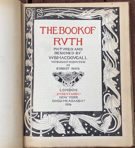
The Book of Ruth

The Book of Ruth, J.M Dent, London and Dodd, Mead, & Co., New York, 1896
A few days ago, the host of a sleepover set out a stack of books for me and my companions to peruse. The thrift store and flea market treasures included titles clearly targeted to my interests: David Diringer’s classic text, Writing, a work titled How to Stay Out of Jail, and the intriguing Insects as Pets. Layered in among them was a slim volume whose deckle-edged pages waved at me like a semaphore. The rippled paper sheets promised a reward. Even before I slipped the book free of its companions, I knew it had to have been published in the decades spanning the turn of the last century when a vogue for fine printing saturated the broader market with well-designed and carefully crafted volumes. In spite of the temptation to learn how to feed a family of crickets or avoid criminal behavior, I picked up The Book of Ruth.
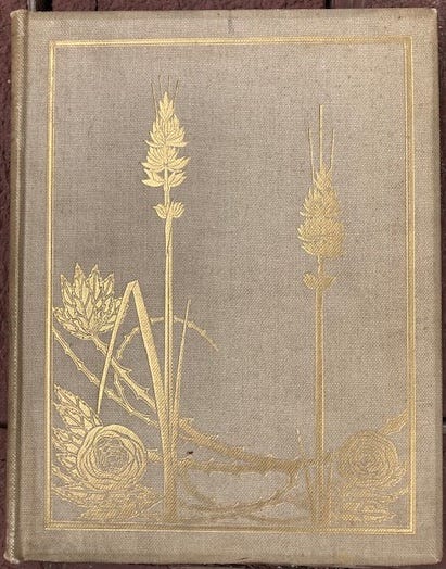
Gold stamped cover of The Book of Ruth
The book was bound in buckram, a heavily textured cloth, favorite of mass-market binders for its sturdiness and durability. A loose weave linen, buckram became popular in the 19th century as publishers’ bindings gradually became the norm, replacing the issue of editions in paper wrappers for collectors to bind in their private library style. The combination of compulsory schooling, a rising middle class, and shifts in literacy patterns had contributed to the development of new readerships. The publishing industry responded with massively increased numbers of books, but also, gift bindings with elaborately decorated pages, illustrations in black and white, and then lavish color lithography. Unlike the 20th century, when illustration migrated into the narrow zone of children’s literature, the 19th century was full of volumes for adult readers replete with vignettes and plates, floral initial letters, fancy title pages, and other visually engaging features. Charles Dickens novels were enhanced by the work of the wonderful artist Phiz, Gustave Doré had a prolific output, and George Cruikshank’s wickedly irreverent visions appeared regularly in print. This is just the tip of the illustration pantheon iceberg.
But something in this copy of The Book of Ruth said “Scotland” to me. Perhaps it was the elongated vertical elements in the illustrations, their division of space reminiscent of the architectural motifs in the work of designer Charles Rennie Mackintosh and artist Margaret Macdonald, key figures in defining the Glasgow Style in the 1890s. The book I was holding in my hands was immediately identifiable as part of what became an international style in in Europe, the British Isles, and the United States in the decades spanning the end of the 19th and beginning of the 20th century. Flowers, flowing hair, climbing vines, and sylph-like female bodies entwined in endless variation of soft and supple forms. The Viennese Secession, German Jugendstijl, French Art Nouveau, and Arts and Crafts in the British Isles and North America were among the most conspicuous and widespread movements whose aesthetics influenced craft and industrial production in textile design, home furnishings, and graphic arts.
Gold stamped into the oat colored buckram cover, the sinewy organic forms on this modest commercial volume shimmer in the light. The buckram texture fights a little with the pattern, being just a bit too coarse and utilitarian. But the straight stalks of the blooming grasses cut across the arc of the thorn-covered stems with enough sensuality to hold their own within the outer frame. The gentle asymmetry of the design reflects the influence of Japanese art, structuring of movement into and out of the composition. The beveled edge of the binding boards adds a touch of refinement to the object, showing thoughtful consideration of the transition from cover to pages. The book is made at a scale meant to be held in the hand at just the right distance for reading, because this is a trade book, not a work of art to be contemplated and admired from a distance. Still, the book appropriates many features of luxury volumes, and its carefully crafted publication is an eloquent testament to the way Arts and Crafts book design rapidly saturated a broad market in the 1890s.
The publication date of 1896 is all the more remarkable because that is the year that William Morris’s monumental The Works of Geoffrey Chaucer Now Newly Imprinted was published. Even the word monumental does not do justice to Morris’s massive volume, which was not designed to be read, but to enshrine the great poet’s work in a fitting tribute to his contribution to English letters. Morris’s designs, combined with the illustrations carved in wood by Edward Burne-Jones, created a major landmark in book production and fine press printing. Morris designed a font exclusively for the text, Chaucer, and supervised production of paper and ink to be sure the work met his specifications. The title page spreads create a tapestry that successfully evokes the medieval world that Morris attempted to echo in his Kelmscott Press through editorial as well as design decisions. The upshot of his efforts, however, was the production of works so deluxe they could only be purchased by very affluent collectors. The Kelmscott Chaucer is not a gift book for a minor occasion, but an expensive tome whose renown conferred status on its owners even as it spawned rapid and widespread imitation.
Certain highly conspicuous features from Morris’s work show up in derivative form in The Book of Ruth. The type and setting of the text and proportions on the page are similar, though smaller in scale. Above all, the illustrations, framing borders, and decorative elements are all imitations of those of Morris and Burne-Jones. But where Morris was a consummate designer, able to balance tonal values, frequencies and rhythms, the stabilizing and dynamic aspects of patterns, the designer for The Book of Ruth is often only able to imitate the idea, not the details of execution, that characterize Morris’s work. This is interesting because it is evidence that the publishers in New York and London who brought out this volume knew that if it looked like Morris’s work, it would have a strong appeal. Morris, after all, was internationally renown for his wallpaper and textile design, and though the Kelmscott Press was the last of his undertakings (he died in 1896), its reputation was built on the graphic style he had established.
Still, I was curious about the Scottish feel of the work and my investigation of other features of this edition of The Book of Ruth soon connected it to a particular social and cultural milieu. The illustrator W.B. Macdougall, in his late 20s at the time, had studied at the Glasgow Academy in the late 1880s.[1] This put him squarely in the middle of the emerging Scottish Arts and Crafts movement, exposed to the circle of artists and designers that included Charles Rennie Macintosh (already mentioned), Margaret MacDonald (ditto) and her sister Frances, along with Herbert MacNair and others. Their work included an emphasis on Celtic motifs blended with the elongated, sinewy, asymmetrical compositions typical of Arts and Crafts elsewhere. During his brief, two-year career as an illustrator, Macdougall published in the trendiest journals of the decade including The Yellow Book and The Savoy alongside Aubrey Beardsley. The titles he illustrated followed the pattern of attention to medieval tales, mythic history, and early sagas (also favored by Morris): such as The Fall of the Nibelungs, The Chronicles of Strathearn (an iconic Scottish valley), and the Rubaiyat of Omar Khayyam, the Astronomer Poet of Persia.
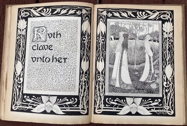
Macdougal’s illustrations are adequate, but bland. They lack the graphic sophistication of Burne-Jones’s control of line and pattern evident in the Chaucer where Jones makes every line count, including it in a pattern. Take this page spread as an example. The outer borders are cut in high contrast black and white that overwhelms the more delicate tonal range of the chapter title and the image of the women in the garden, probably not designed by Macdougal. In fact, the page is an assemblage of mismatched graphic elements, not a well-thought out whole. The majuscule “R” in Ruth is inconsequential. The fronds that enframe the letterform chip away at its integrity and it has no dark accents to make it stand out clearly. The vine pattern behind the words is delicate enough for the dark letters to be visible, but the pattern is not really taken into account so that the counter of the “e” in the final word “her” is clogged with visual noise. More importantly, the grey tone of the vine pattern is not strong enough to create a distinct border from the white space that separates it from the outer frame, so the whole page falls apart. By contrast, the motifs in the border frame are beautifully delineated. The symmetrical shape at the bottom, with its neatly drawn linear elements, shows an expertise lacking in the design above where the “R” should have been designed with the same skill, but is clearly drawn by a different person.
The illustration on the facing page suffers from some of the same anemia. The gowns of figures are the most clearly visible elements of the image, and their vertical white drape organizes the composition by cutting across the various zones of ground, path, and foliage. But the faces have no character at all, hardly the profiles of women meant to inspire with the force of the tale. Ruth, after all, is a heroine in the Jewish bible, a non-Jew who marries Boaz and then pledges full loyalty to the Hebrew God. Her child, Obed, is the direct ancestor of Jesse, and thus of David who becomes the legendary King, and whose own descendants are traced to Jesus. The pale maiden trailing in the garden with a bland profile hardly seems like a figure of such significance. Macdougal seems to lack conviction, graphical or narratological, and so the imagery appears banal and boring. The suggestive artfulness of Beardsley or the engaging charm of the masterful Walter Crane are utterly lacking. But more to the point of the whole here, Macdougal is imitating, not inventing. His aesthetic in these images is second-hand, and he is aspiring to an art he remains outside of to a great extent. But to a casual eye, the book looks just like the work of Morris and Burne-Jones, and its blackletter-ish type, organic patterns, heavily over-stuffed pages, and floral motifs would have had immediate recognizable appeal.
Another important element of the book is the introduction by Ernest Rhys. He touches on the significance of The Book of Ruth and the connection to the people of Israel through Ruth’s loyalty to her mother-in-law, Naomi, and then her marriage to Boaz. The story also celebrates her appreciation of the fertility of the land east of the Jordan River. Ruth is gleaner, gathering and threshing grain, and thus associated with the spring harvest. Other interpretations of Ruth stress the Covenant in which God says to Abraham “I give to you all the land that you see to you and your offspring forever.” (Genesis 13:14-16)[2] In his introduction, Rhys repeatedly invokes Dean (Arthur) Stanley, a progressive theologian who was also the author of the 1856 work Sinai and Palestine in Connexion with Their History.[3] Furthermore, in 1865, Stanley was one of the founders of the Palestine Exploration Fund which was supported by Queen Victoria.
Rhys was affiliated with the Fabian Society and Socialist League through which he met William Morris, among others. Rhys also associated with various literary figures and circles, and had convinced the publisher J.M. Dent to start the Everyman’s Library dedicated to affordable editions of the classics (nearly a thousand titles were published in the series by the time Rhys died in 1946).[4] J.M.Dent and Co., London, were co-publishers of The Book of Ruth along with Dodd, Mead, and Co., New York. But the volume was printed in Edinburgh, evidence of its connection to Scottish culture—a link reinforced through Macdonald’s having illustrated the work of one of the most beloved and renown Scottish authors, Robert Louis Stevenson, who had died in 1894.
All of this weaves a tight set of interconnections among the images, style, themes, texts and historical subtexts of the volume whose gently aging paper rustles with life, still luminous as the pages are turned. If the imagery pales a bit, and the design of the interior suffers from being derivative, the volume itself has an authenticity as a mass-produced item through which the ideas of the Arts and Crafts movement circulated to broad audiences of readers. The object speaks eloquently of its cultural moment and embodies in every detail the trace of readerships both conceived and served by the aspirations of it publishers. What a surprise to open up such a volume and suddenly feel that whole vanished world appear in a sweet small house in Antelope Valley, California, barely more than an hour from Los Angeles and more than a century after its publication. The capacity of materials to carry meaning and provoke inquiry across time and space is indeed profound.
Thanks to Ed Eadon for putting the book in the stack.
[1] Biographical information on Macdougal is taken from this profile: https://www.goodreads.com/author/show/7547058.W_B_Macdougall
[2] Adele Berlin, “Ruth–Big Theme, Little Book,” https://www.biblicalarchaeology.org/daily/biblical-topics/hebrew-bible/the-story-of-ruth/
[3] https://en.wikipedia.org/wiki/Arthur_Penrhyn_Stanley
[4] https://en.wikipedia.org/wiki/Ernest_Rhys