
Primarium: A Case For Cursive
Art Center College of Design, Hoffmitz Milken Center for Typography Wednesday July 2 through Friday October 31, 2025.

The beautifully designed installation of Primarium: A Case for Cursive, currently on view at the Hoffmitz Milken Center for Typography Gallery at Art Center, is a graphically rich introduction to the subject of cursive writing and associated pedagogy.[1] Based on a book I have not read (full disclosure), the exhibit combines historical artifacts and contemporary graphics documenting the history of the cursive writing of Latin letterforms. This is follows the scope and focus of the research of Veronica Burian and José Scaglione, authors of Primarium, a study of the ways handwriting is taught around the world.[2]
From Primarium, https://www.artcenter.edu/connect/college-news/artcenter-exhibition-primarium-a-case-for-cursive.html
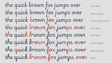
The exhibit has a range of information graphics that allow comparison across scripts as well as calling attention to some of the features that distinguish them (loops, entries, knots etc.). Once these are named and made evident, the differences are striking, but I was not aware of the typology of script forms or the nomenclature of the classification system before seeing it presented here. The printed handout accompanying the exhibit provides samples of more than sixty letterforms from forty countries with their own colorful range of names. For instance, from Brazil, we get “Kindergarten,” a full, upright, round style with some open forms while Colombia provides “Learning Curve,” an irresistible name for the slightly tilted orientation of the shapes. Among my favorites is a British contribution, “Twinkl Cursive,” with spare clean geometric shapes that makes the also British Sassoon Williams above it look mannered and slightly affected by comparison. Contrast is so helpful in training the eye to see the differences across these scripts, and once engaged with the variety of loops and tails, curved flourishes and rope-like swerves, one’s attention is caught. I could look for hours at the complexities of the Vietnamese script, marveling that students master its idiosyncracies while the US-based “Handwriting Without Tears” is only slightly less challenging in spite of the name.
The differences among the cursive variations don’t map, at least at first glance, onto a simple geographical logic though being given their location is both interesting and useful. The more minimal approach found in the Spanish examples also appears in Turkey, England, and Nigeria, among other nations while the more decorative samples from Portugal, Australia, and Belgium still stop short of the extravagant Vietnamese example. How and why such forms take hold and are passed on may be as much a matter of convention and training as choice. We learn from the models presented to us in our education not necessarily knowing they identify a national affiliation.
The lineage of these scripts and their relation to patterns of cultural diffusion would be interesting to know, along with the extent to which, in modern times, their adoption followed colonial patterns of trade and exchange. In the longer history of Latin letterforms, the distribution of earlier scripts around the Mediterranean and their gradual specialization within cultural traditions can be traced through inscriptions and physical evidence. The Latin letterforms that feature here were part of a proliferation of scripts that emerged after the break-up of the Roman empire gave rise to local hands across the British Isles, Europe, and elsewhere even as alphabetic variants emerged or were introduced as modifications (Cyrllic and Armenian as two examples of deliberate modification). The original Latin letterforms were themselves variants of the Semitic script spread by Phoenician traders around the Mediterranean in the 11th and 12th centuries BCE. The Phoenicians did not invent the script, which had emerged earlier in the second millennium in the ancient Levant (and perhaps North Africa, though that evidence is still scant), but through their trade and exchange brought it to Greece, Italy, the Iberian peninsula and the other islands and nations throughout the region. The early Etruscan examples bear a strong resemblance to the Phoenician models, and the oldest preserved Latin inscription is from the 7th century BCE on a cloak pin, the Praeneste Fibula. A timeline of milestones in the history of writing (a slight misnomer, since it traces only the Latin letters) gives a brief overview of developments as do the many images of exercises and models developed for pedagogical use.
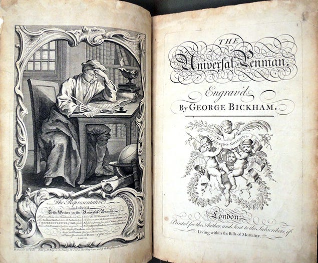
George Bickham, The Universal Penman, Engrav’d. 1733-41, London.
But these historical lineages are only part of the story that Primarium presents. Because their focus is on pedagogy, the researchers show a number of images and details from writing manuals and training materials. These are fascinating for the extent to which they reveal the disciplining of the body essential for producing good scripts. Posture, hand position, orientation of the pen to the paper, and every other aspect of the muscle training essential for becoming an expert penman are part of the instruction. The elegance of the early manuals for writing remains unsurpassed, and the engraved plates made to spread instruction, such as the classic George Bickham’s The Universal Penman, boggle the mind. According to the Princeton Graphic Arts site, his plates were issued in 52 parts between 1733 and 1741.[3] The exquisiteness and skill of the engravings are flawless in their design and execution. The rest of Bickham’s full title is worth citing, since the subtitle makes clear the value of the work: The Art of Writing Made Useful to the Gentleman and Scholar, As Well as the Man of Business. If variants of the Latin script had already established a hierarchy of purpose for transcribing sacred texts, offering court documents, providing records of private and public affairs, and differentiating ceremonial and utilitarian texts for hundreds of years, the development of business practices as well as colonial governments created a need for expertise in a much broader range of activities. The role of the clerk in every sphere of 18th century life, as well as the dependence on epistolary communications, is evident in Bickham’s identification of his audience. The gentleman, the scholar, and the man of business—and of course, our literary friends as well as those concerned with more mundane (if more lucrative) affairs—must all be versed in the art of penmanship.
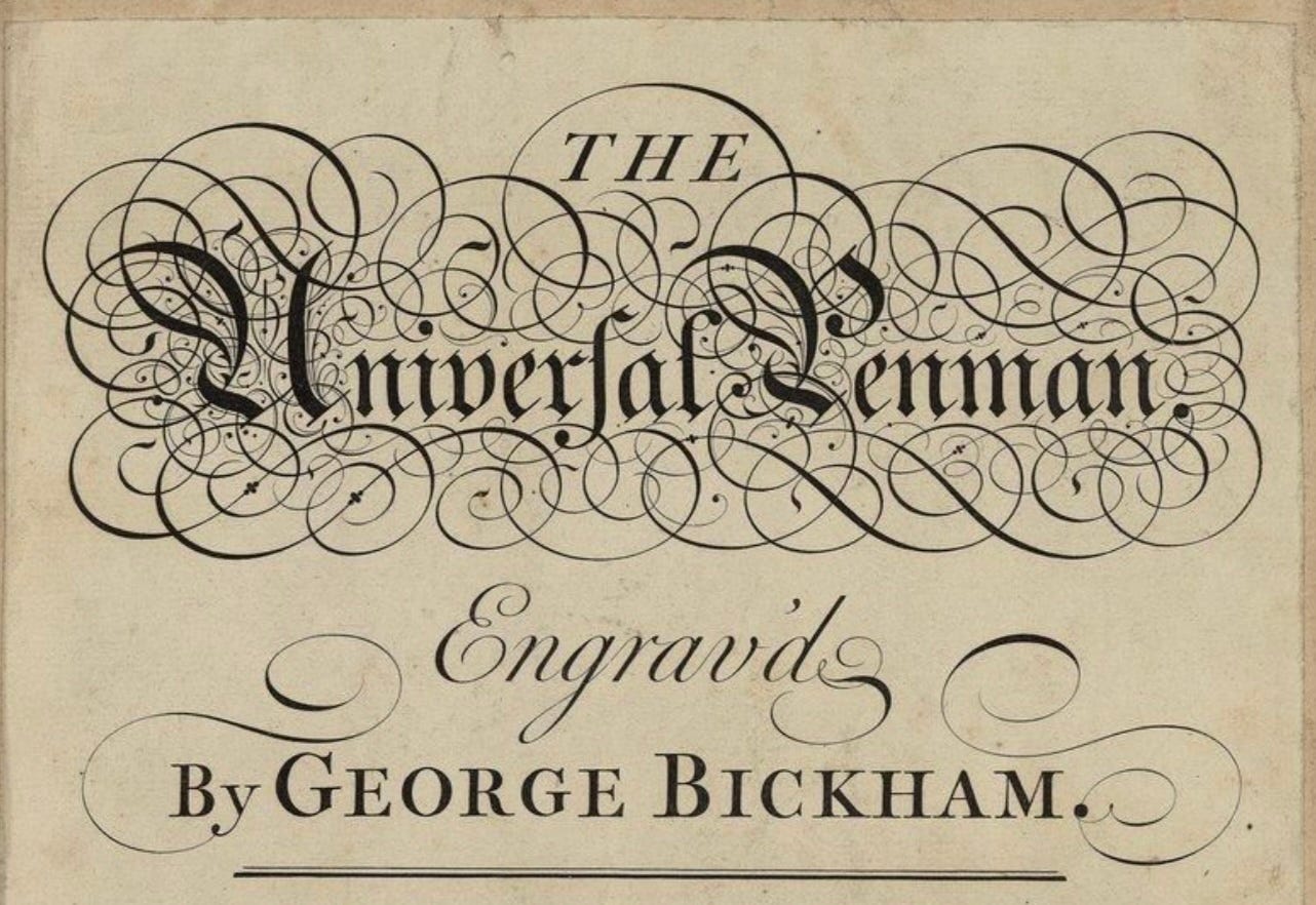
Detail from the title page of Bickham’s manual.
And an art it was. The title plate for Bickham’s book would have been written with a quill pen, transferred to a steel or copper plate, and then carved intaglio in reverse with a burin removing metal in perfectly executed lines whose width varies as if it were the easy and natural expression of pressure on the point of a pen. (It is not, it is a carving into the surface of the plate.) Metal pen points were not in regular use or manufacture until the end of the 18th century, so not surprisingly, the figure writing in the frontispiece of Bickham’s manual is holding a feather quill.[4] Writing manuals have a long history, and also continue to be issued with new approaches and formats. For example, at the end of the 19th century, Austin Palmer created his (also classic) Palmer’s Guide to Business Writing based on a different discipline of arm muscles and a streamlined script that increased the speed of production. First published in 1894, it also contained images of the correct posture and positions for writing, and the fact that even in 1912 it sold more than a million copies shows how important script remained in business even after the invention and adoption of the typewriter decades earlier.[5]
The fate of handwriting in contemporary culture is more precarious. Cursive ceased to be taught some time ago in the Los Angeles Unified School District and other systems. In 2010 it was dropped from the Common Core of national education standards. Considered obsolete, no longer as essential as working a keyboard, cursive writing became an esoteric skill. When I was at a conference just a couple of years ago, notepad in front of me, the young person in the seat beside me looked with astonishment at what I was doing. “You can write??” Apparently this was such a novelty that it stopped them cold, as if regarding someone capable of chiseling stone or spinning flax.
Realizations that cursive promotes cognitive skills, intellectual development, and that handwriting has a different effect on memory than typing have all contributed to its revival. In California, we have even had Assembly Bill 446 sponsored by a former elementary school teacher, Sharon Quirk-Silva, to ensure handwriting instruction has been returned to the curriculum beginning in the third grade.[6]
That, in fact, was the age at which I learned the technique, though I looked forward to it for some time in advance. Cursive was an aspirational skill, reserved then as well as now for those third grade students for whom the lined sheets with their marked proportions were used to discipline their still childish hands into conformity with the models displayed prominently on the walls of the classroom. I wanted to learn handwriting the way some others wanted a two-wheeled bike without training wheels. Cursive was the adult writing system, entry to the realm of swift composition and individual signatures. After the arduous and careful performance of stick figure printing, cursive looked to have the freedom and grace of figure skating on the page, a flowing motion in which the hand could glide and sweep with elegant style.
Primarium introduces this fascinating and important topic in a graphically rich and engaging exhibit that gives insight into just how interesting this history is and how it is relevant in the present. Not only are Latin letterforms in use throughout the world, along with the other scripts that derive from the proto-Sinaitic taproot of Semitic sources, but the history of their dissemination and modification encode much information about cultural identities and formations that are expressed daily in those exercises of the hand, the making of marks with ink on paper, that continue to allow thought to be expressed in disciplined, coherent, and (sometimes) legible form. The beauty of the letters is equaled only by the pleasure of their making, the patient execution of a code that connects us to a long history of literacy practices with a global range. In addition, learning the letters allows access to the reading of the written record, so much of which is in cursive and appears opaque and mysterious to the uninitiated.
This is a beautiful exhibit, highly engaging, and will resonate with visitors acquainted with cursive script or being introduced to its many forms and varieties for the first (!) time.
[1] https://www.artcenter.edu/connect/college-news/artcenter-exhibition-primarium-a-case-for-cursive.html
[2] https://primarium.info/handwriting-models
[3] Universal Penman variations, Graphic Arts Collection, Princeton, Special Collections. No individual author given and no date. https://graphicarts.princeton.edu/2020/12/08/universal-penman-variations/
[4] “Pointed Metal Nibs: Not as Old as You Think.” Itinerant Scribe. https://itinerant-scribe.com/2018/04/25/pointed-metal-pen-nibs-not-as-old-as-you-think/
[5] https://en.wikipedia.org/wiki/Palmer_Method
[6] Daniel Trotta, “Shunned in computer age, cursive makes a comeback in California.” January 27, 2024. https://www.reuters.com/world/us/shunned-computer-age-cursive-makes-comeback-california-2024-01-27/