
Parallel Reading:
California Modernism and Book Design

Modern Book Design in Southern California
When and how does book design become “modern” in Southern California? And what insights does this inquiry provide into the cultural development of the region in the early decades of the 20th century? These questions guided the curatorial decisions I made for the recent exhibit Parallel Reading: Book Design and California Modernism at the William Andrews Clark Memorial Library. The exhibit was prompted in part as a follow up to one that Brad Freeman and I were invited to curate for the MAK Center at the Schindler House in West Hollywood last summer. The curatorial team there was hosting a series of programs to “activate” the spaces of the house through display and engagement with books in a series titled “Reading Room”. For that exhibit we selected artists’ books that 1) worked directly with architectural themes or images, 2) echoed approaches to surfaces, spaces, materials, framing that are essential to architecture, or 3) used a conceptual approach to book structure similar that had some relation to what is used to create built form. In our initial conversation, guest curator Robert Kett cited book artist Ulises Carrión’s oft-quoted phrase, “A book is a sequence of spaces,” as shared inspiration.
The experience of being in the Schindler House (also known as the King’s Road House) is viscerally engaging. The house is such a remarkably intact work of radical modern architectural design that it feels completely contemporary. Finished in 1922, the one-story structure embodies Schindler’s vision of a minimalist space of light and air, organized through volumes, frames, and eyelines. The house was built for two couples, Schindler and his wife Pauline and their friends, Clyde and Marian Chace. Each individual had their own dedicated studio space with a shared utility area (kitchen and bath). The living areas were outdoor gardens and they slept in tent-like “baskets” on the roof. In other words, the conventional program of domestic architecture was jettisoned completely. The walls were a combination of poured (tilted) concrete and sliding canvas panels. The apocryphal tale is that Schindler had been inspired by the structure of the tent he and his wife used on a camping trip to Yosemite. The effect of California light and air had been profound, and one can easily imagine how the Austrian-born architect felt liberated by the climate in which he found himself. The result was not just a shift in materials and style, but in the conceptual foundations of design.
To reiterate, walking through the King’s Road House is a revelation, its stripped down clarity of formal relations and sequence of frames and surfaces articulate the space that is without any decoration, superfluous elements, or distractions. Modernism in Schindler’s vision, as the house makes clear, involved a systematic approach to design enabled by integrity of materials and structures. I was struck by this idea, and felt this could be crucial to thinking about book design as it emerges from the decorative stylistic excesses of late 19th century Victorian and Arts and Crafts production into a modern form. What, if any, Southern California printed works registered a similar change in attitude and approach? Did the climate and culture have an effect?
In the 1890s, when fine printing took hold in San Francisco, the predominant style trend was directly inspired by the English Arts and Crafts movement, particularly the work of William Morris and his Kelmscott Press. Ornate, organic motifs featured tangled vines, women with flowing hair and mythic creatures or floral patterns. These elements were part of European design trends in the Viennese Secession (whose architectural style played a role in Schindler’s education) as well as other movements whose influence spread internationally. In San Francisco, the printing firm established by Paul Elder and John Henry Nash exhibited this influence in their promotional materials, such as the Impressions Quarterly, a publication showing off their printing skills. Graphically arresting, the cover remains striking more than a century after its 1903 publication, though the style is clearly of its era. Nash, who later parted ways with Elder and established his own company, had a reputation as an elegant printer and was sought after by many wealthy patrons, including William Andrews Clark Jr. Clark commissioned him to produce keepsakes, limited editions, and even, in a rather extravagant gesture, the first full run of 20 some volumes of the original catalogue of the Library’s collections in the early 1930s.
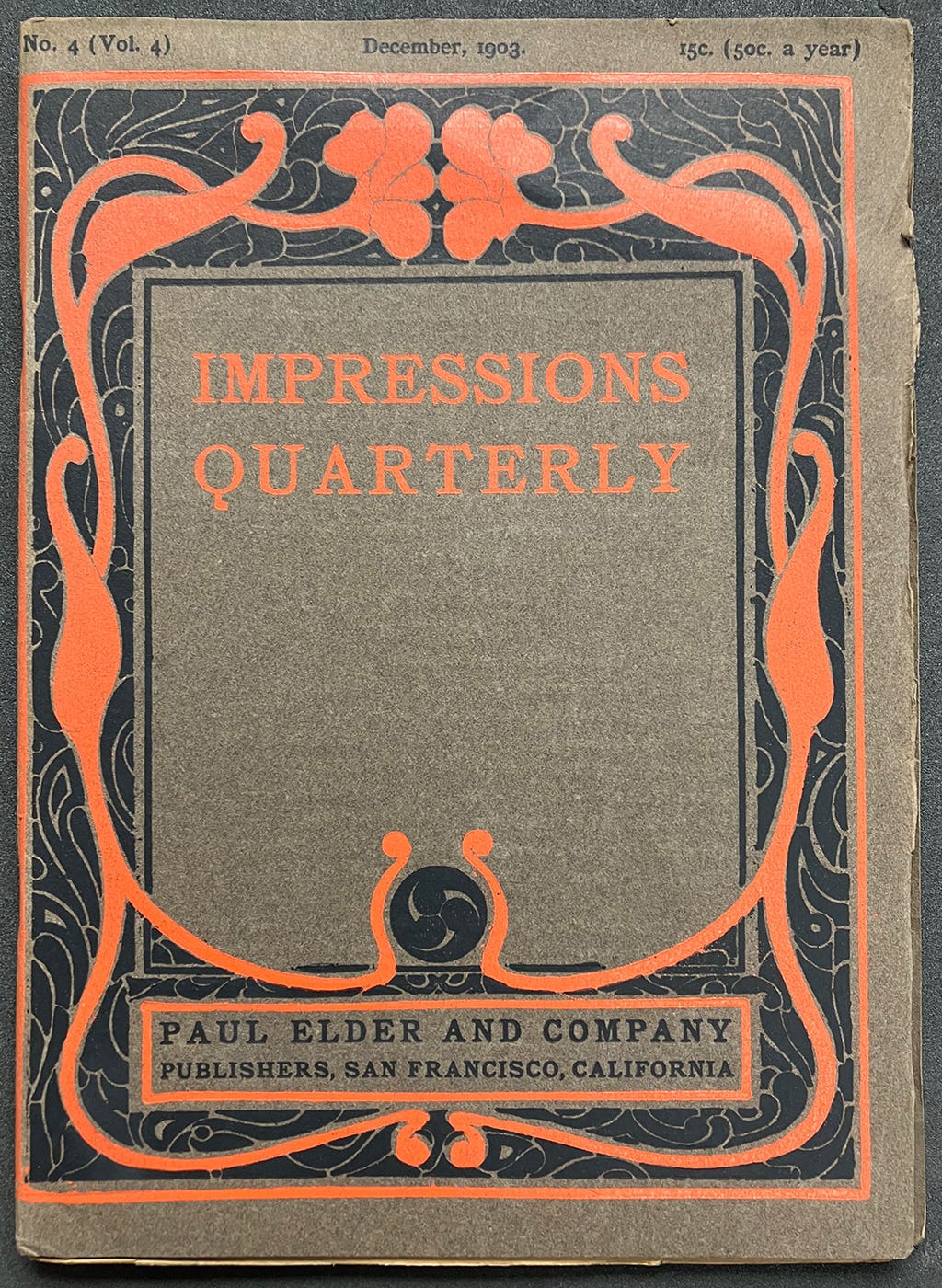
Paul Elder and Company, Impressions Quarterly, Vol. 4, No.4, 1903.
From the perspective of social history and print production, Clark’s connection with Nash signified the ways wealthy patrons signalled their status through conspicuously luxurious items, including fine press printing. High end production values, exquisite setting and design, and limited editions were features of the works that came out of Nash’s shop. His private clients were a select set. In addition to commissions for Clark, Nash produced work for other wealthy persons, such as Estelle Doheny, also a figure in Southern California bibliographical circles. Book collecting was a sign of refinement for patrons of the arts even as they helped to build major cultural institutions such as libraries and museums.
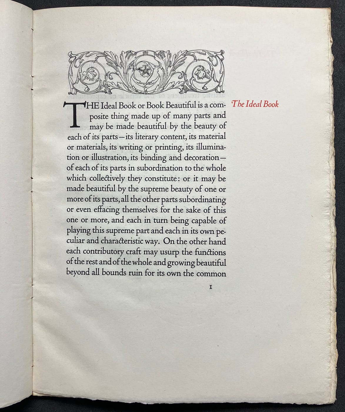
T.J. (Thomas James) Cobden-Sanderson, The Ideal Book, or, Book Beautiful, San Francisco, CA: Privately printed by John Henry Nash, 1916
Nash’s aesthetic was closely aligned with that of the English printer and colleague of Morris’s, Thomas Cobden-Sanderson. Nash produced Cobden-Sanderson’s influential essay, The Ideal Book, or, Book Beautiful, in a limited edition in 1916. The text, written in the final decade of the 19th century, called for a return to the high standards of the incunabula period of the mid-15th century when humanist printers in Italy, in particular, produced works considered to embody the highest standard of design ever achieved. Like Morris, Cobden-Sanderson (and others) embraced these principles as a response to the degraded condition into which they felt industrial methods had pushed printing in the 19th century. These were principles formulated as an aesthetic of style and production quality–but not as a systematic approach to the book as a form. This distinction is significant in reflecting on the question posed at the outset, what makes book design “modern”? Was it stylistic features or a rethinking of the ways a book “works” as a spatial-temporal form? Or some combination of both?
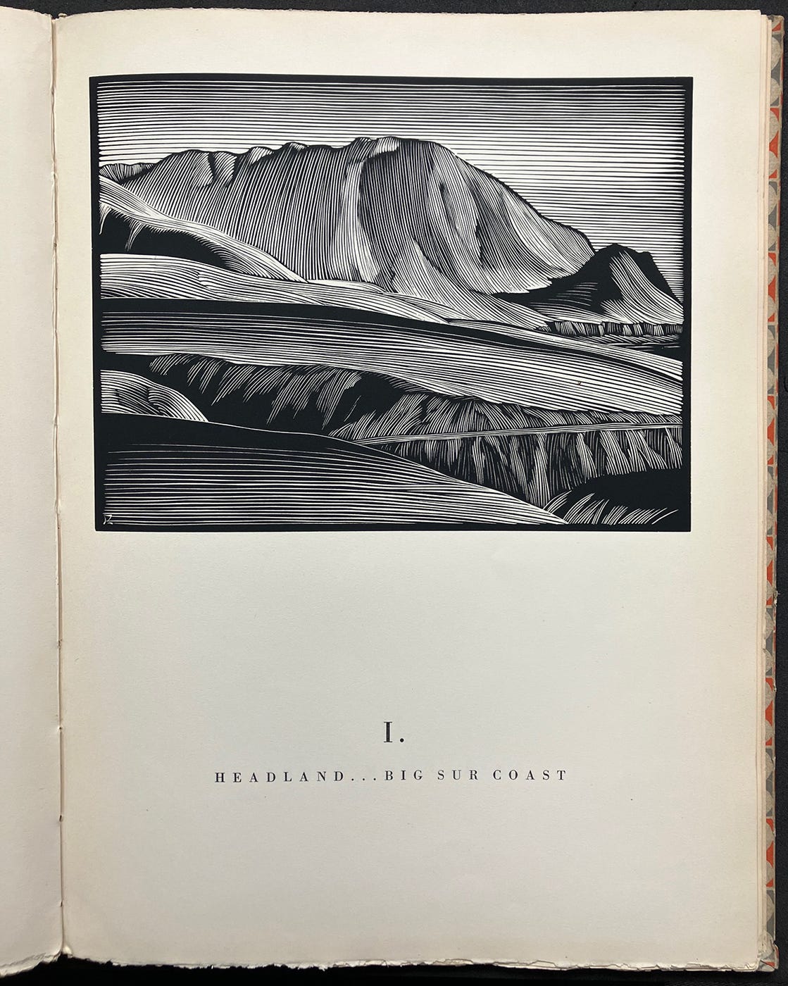
Paul Landacre, California Hills and Other Wood Engravings, Los Angeles, CA: Bruce McCallister, 1931
In Los Angeles the fine press community came into being slowly and later than in Northern California. Bruce McCallister opened a shop in 1915 but was focused mainly on job work. One of his major contributions was to publish Paul Landacre’s California Hills (1930), the artist’s first significant work. Landacre was a wood engraver who had a distinctive style, and the images for the book were drawn during a road trip with his wife and friends touring California. The iconography of the volume reflects the Romantic vision of empty landscapes available for settlement and void of human habitation, the pristine land able to be appropriated and occupied. Of course, that was not the case, and the erasure of Indigenous peoples in Landacres’s work was not his doing but extended a Romantic concept of the open lands of America waiting for settlement. Landacre himself was a progressive and activist figure, but his images participate in a particular ideology, The volume itself, appearing as it did in 1930, shows a serious commitment to publishing local artists and cultures.
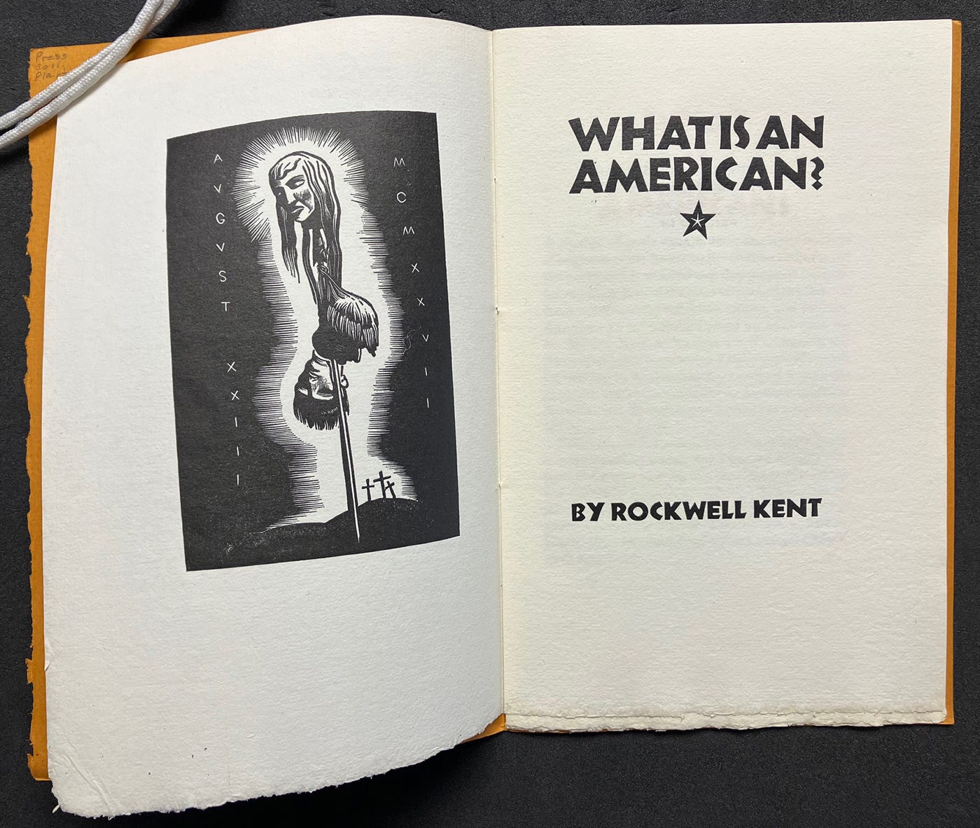
The arrival of Jake Zeitlin to Los Angeles, in 1925, provided a galvanizing force for art and literary publishing as well as collecting, since he was a dealer who ran a small gallery space in his bookstore. He also established an imprint, Primavera Press, that published contemporary writers, Californiana, and other works in carefully designed volumes. By 1929, the community of bibliophiles had grown large enough to create the Zamorano Club to share common interests and unique collecting passions. Saul and Lillian Marks founded their Plantin Press in 1931. Named for the famous 16th century Dutch printer, the Press issued beautifully produced books under its own imprint, as well as ephemera, broadsides and pamphlets. Careful attention to detail made their work distinct, with each piece thoughtfully conceived to integrate concepts, themes, materials, and design. Their 1936 publication of renowned artist Rockwell Kent’s What Is An American? Protesting his investigation for political beliefs, the booklet had a powerfully stark graphic quality meant to reinforce its direct message of democratic principles
.
Rockwell Kent, What Is An American? Los Angeles, CA: Plantin Press, 1936
By the late 1920s and early 1930s, stylistic features appearing in illustrations in California books had become distinctly moderne. The elegantly streamlined and geometricized forms all mark their distance from the elaborately decorative imagery that was prevalent a few decades earlier. For example, Valenti Angelo’s images for Jake Zeitlin’s 1927 For Whispers and Chants and the cover image for Madeleine Ruthven’s 1932 Summer Denial, bore a strong resemblance to the illustrations produced by British and French artists in the same period—even many used for advertising and commerce. These designs began to have some of the lightness and space of emerging architecture, letting air into the pages.
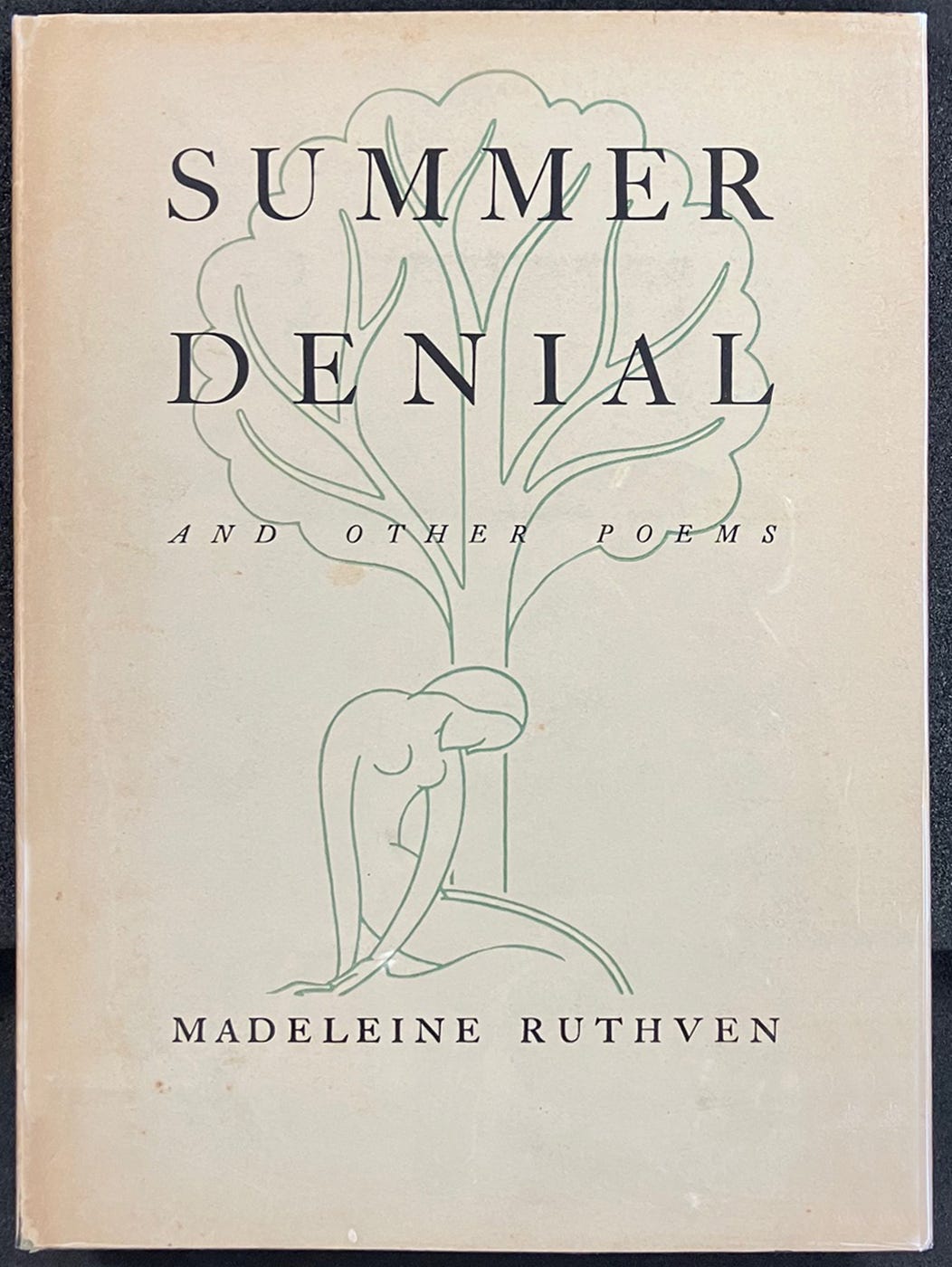
Madeleine Ruthven, Summer denial and other poems, Los Angeles, CA: Primavera Press, 1932
But changes in the way the design of books was conceived came from the influence of French designer and artist François-Louis Schmied by way of the young Ward Ritchie who would become a major figure in Los Angeles fine press publishing. Ritchie went to Paris to apprentice with Schmied, whose understanding of the book as an articulation of relations across pages and openings was unusually sophisticated. Schmied thought of design in terms of a set of components that were put into dynamic relations. Rather than establish a single static template in which text elements and images appeared in repetitive sequence, Schmied manipulated these elements in a creative combination of continuity and variety. Each of Schmied’s books is different, but the way of working with systematic coherence is consistent throughout.
Robinson Jeffers, Apology for Bad Dreams, Paris: Ward Ritchie, 1930
While in Paris studying with Schmied, Ritchie completed his first apprenticeship project, a small edition of California poet Robinson Jeffers’s Apology for Bad Dreams (1930). Though features of the work are amateurish by contrast to the designs of his mentor (a highly symmetrical title page with central axis instead of the dynamic play of elements in an asymmetric arrangement), it shows clear evidence of lessons learned. Ritchie returned to Los Angeles and then designed the annual yearbook for his alma mater, Occidental College. The lively character of that publication made good use of the approach he had absorbed from Schmied with elements of color, shape, page structure, sequence, and organization all working with the book as a form articulated in time and space.
Other figures in the Los Angeles scene, in addition to those already mentioned, included the dynamic impresario and gifted designer, Merle Armitage. Armitage achieved a national reputation for his book design, as a monographic volume dedicated to his work by a New York publisher in 1938 testifies. When Ritchie published Alfred Young Fisher’s The Ghost in the Underblows (1940), he engaged the talented Alvin Lustig as a designer. Lustig’s decorative elements, composed from geometric dingbats organized into abstract patterns of modular forms, echo the approach to working that undergirds the systematic manipulation of components and relations that characterized one aspect of modern design.
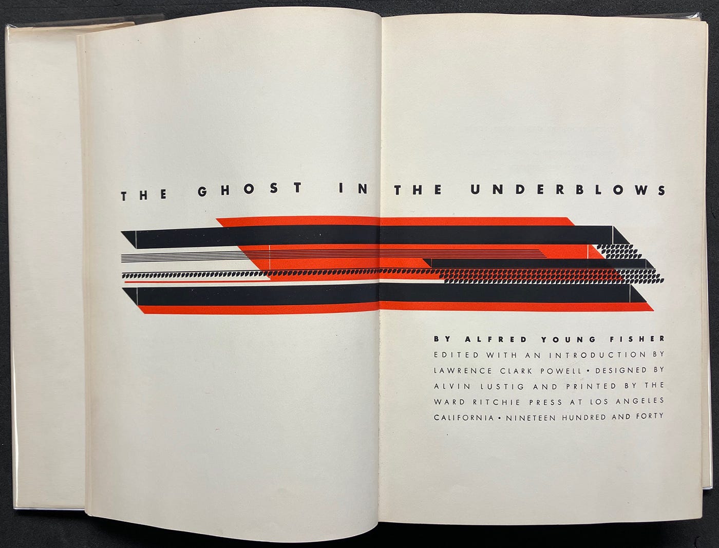
Alfred Young Fisher, Ghost in the Underblows Los Angeles, CA: Ward Ritchie Press, 1940
Other trends and sensibilities remained as well, particularly the influence of what is termed the “Humanist revival” in book publication. After WWII, a wide variety of designers and artists would bring their own sensibilities into play as literary activity in California began to flourish. Pop art, conceptual work, the feminist movement and other sensibilities informed publication design. Fine press, artists’ books, independent and activist publication existed in a complex ecosystem that supported artistic traditions and innovations that continue to this day. Being “modern” had cachet in architecture, graphic design, fashion, and other areas of cultural practice, but it was not necessarily the goal or even a perceived advantage for fine press printers and publishers for whom continuation of tradition had its own status and associations. What is interesting to observe in Los Angeles is the specific niche the works of Ritchie, Armitage, and others in the interlocking social communities of literary and artistic culture up through the 1930s. One perhaps not surprising feature of these networks is that they did not include any persons of color whose publishing venues remained within their own communities until the post-War expansion of activism and civil rights changed the literary and publishing landscape.
Fine press book designs became contemporary without necessarily being modern, which is to say that the eclectic use of traditions and conventions of long lineage was informed by modern conceptual approaches but not defined by them. Fine press publications played a role in the social life of Los Angeles in an era when they conferred status on collectors and fostered bibliophilic activity whose variety was–and is–evident in the vitality of ongoing publication art.
So interesting! So bummed to have missed this exhibition, wow. Looks like it was incredible.