Ouvert Oeuvre: Openings & Touching in the Wake of the Virus
Poems by Adeena Karasick, Visualized by Warren Lehrer, Lavender Ink, 2023
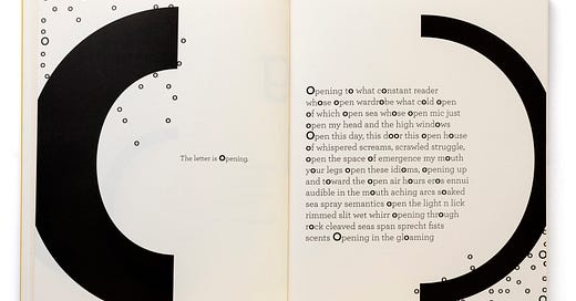
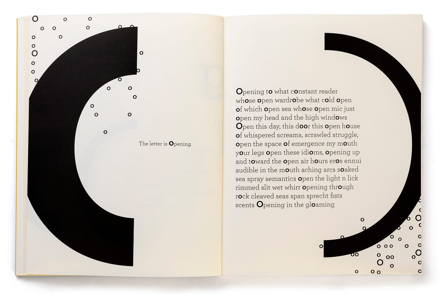
Ouvert Oeuvre, opening spread, by permission of the artists (Lehrer and Karasick).
The deluge of Corona-virus works—endless variations on the diary of the plague year—has not materialized to the extent which some of us dreaded. Still, the lockdown and its aftermath are showing up in literary texts and gallery exhibits at a steady pace. We reflect on the extreme circumstances endured and the changes wrought by the lapsed continuity in patterns and routines. Loss, sadness, gaps in development and relationships, and a peculiar absence of metrics for gauging time in the pandemic remain palpable.
Ouvert Oeuvre, a vivid new graphic-text collaboration by poet-theorist Adeena Karasick and writer-designer Warren Lehrer, has the subtitle, “in the wake of the virus,” marking our distance from lockdown. Return and reawakening register in subtle observations of “opening” so that the earlier closing is implied rather than addressed. We are back in the world, sort-of, through milestones and marked moments in which the concept of “open” carries a variety of meanings (sort-of, partially, fully, not-quite).
I have been a fan of Lehrer’s work for decades and was recently introduced to Karasick’s writings when invited to blurb her Massaging the Medium: Seven Pechakuchas, a collection of linguistically smart and timely critical-poetic texts. This new collaboration by Lehrer and Karasick provides an opportunity to think about the way the design of language transforms and informs a work. Through Lehrer’s visualization Karasick’s text (which might not have filled out a book otherwise) becomes extended and amplified. In my own typo-poietic works, I have been both writer and designer and visual structures emerge simultaneously and in dialogue with the composition. The integration of meaning and format is somewhat different when a finished text gets a typographic treatment by another hand. Though common practice in book and page design, this approach separates the intellectual and aesthetic dimensions of production and conception from each other. Anyone who has ever been a type-setter knows the delicate negotiation involved in designing a writer’s work. Declaring “My work is so NOT Garamond” might be the typographic equivalent of saying, “Don’t ever dress me in Brooks Brothers.” Repressed or flamboyant, kitsch or conservative, fonts strongly inflect language while layouts score and orchestrate texts. These are not subtle matters. Graphic style is not mere accessorizing but an expressive inflection of a text.
Lehrer’s typographic design experience stretches across multiple generations of production technology. He came to digital pre-press through photo-type and offset, layout and even earlier, hand drawn work and letterpress. Acquiring new graphic languages along the way, he is fluent in the manipulation of visual space as surface and stage, an opportunity for organization, orchestration, projection, and display. These are all different dimensions of what is usually taken to be a flat page on which type is present. The manipulations of graphical expression are actually distinct ways of thinking about scale, shape, and space. While this is not the place for a treatise on dimensional design, Lehrer’s work across media and the spatial affordances of graphic art would make a rich study. Each of his works–the scored versations (1980), layered I mean you know (1983), printerly GRRRHHHH: a study of social patterns (1988), visual portrait works from the 1990s–is exemplary in its use of graphic possibilities. His 1984 collaboration with writer Dennis Bernstein, French Fries, became a canonical work almost immediately on publication. It embodied post-modern features of appropriation and dialogue with mass culture in a moment when the break with high modernism was still fracturing art and design communities. Now its combinations of commercial-pop culture iconography and vernacular graphics make it a vivid document of a moment, the best kind of record of history-as-form and substance. Much more could (and has been) said about Lehrer’s accomplishments in this realm.
Lehrer is also a consummate artist of the book, not just typographic scoring. He understands and uses timing, pacing, motifs and repetitions across the development of a work. He has a gift for tone and value, theme and variation, for the distribution of type on a page and across a gutter, and even, in this case, the slight translucency of the paper sheets as an element of the overall visual effect.
The book is divided into two parts, each with its own poem. The first, Ouvert Oeuvre: Openings, contains seven “openings.” The second poem, Touching in the Wake of the Virus, subtitled “A Panddendum” focuses on navigating touch. The two sections complement each other graphically. The first half plays with the “o” motifs that proliferate in Karasick’s text while the second introduces screens and tones that call attention to surfaces and interventions in graphic space.
Karasick’s poem-texts were composed in quarantine, Ouvert on the Big Island of Hawaii, then Touching in New York, though the geography does not play a role in the work which has the insular remove characteristic of the lockdown, even as the theme of opening contrasts with the circumstances. The opening section is a dream, a “specter of a specter” and an image of “a return of all that can never be returned.” This sense of elusive experience and of loss that can hardly be grasped announces the seven openings, which begin with the statement of opening as “a premise, a promise–“. Lehrer bolds the “o’s” that Karasick repeats steadily across vocabulary taken from multiple European languages, creating a polyglot resonance that reflects the global reach of the virus. Lehrer exploits the curves of the “o” to create patterns of sonic resonance and echo effects. Air bubbles and exclamations effervesce while the open counters of other words get filled with dark opaque and somewhat raggedly applied matter. Erotic play and sexual associations are the last evocations of the initial seven sections. But the final opening of the first poem takes the “o” form into its natural affiliation with the corona virus shapes floating through and across the space of the opening. Lehrer even manages the tight registration required to connect two parts of a complex shape across a gutter, no small feat. Keeping the virus forms out of sight until the end of his visualizations gives them optimal effect when they do appear, all too familiar in their ever-present insidious lurking.
Touching in the Wake of the Virus opening, by permission of the artists.
The second poem, “Touching in the Wake of the Virus,” shifts the tone. The type is bold instead of delicate, the pitch shifts to high contrast as enlarged halftone screens define zones and boundaries. Lines, bands, and edges of all kinds appear in graphic play. Vectors of force and torque instantiate a text that also has edges and conflicts: “Can one ever really touch anything” and “touch/without being touched” lead to “rejections, insurrections” and other expressions of tension. After the quieter passages of the first half of the book, these more strident tones register their interruptions and disruptions graphically even as the poem careens towards its final statement, “…if you are haptic and you know it strap your hands…” This punning combination of recognition and restraint is a fitting place to end, its ellipsis suggesting ongoing but uncertain continuity. The impulse to touch has been subject to prohibition and constraint for so long.
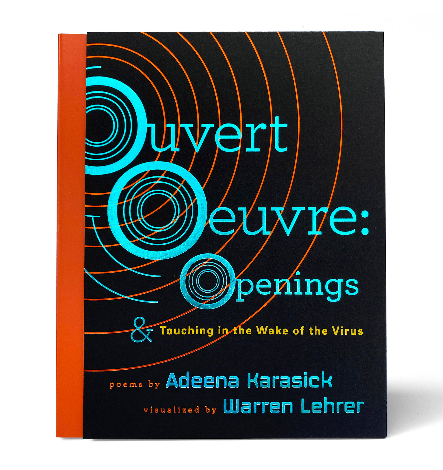
The metallic foil stamped cover design in blue and orange uses similar motifs to the interior, announcing the (typo)graphic treatment right at the outset. The colors are vivid, attractive, and the spine printing is neat and sharp. It’s a vivid book, vibrant and attractive, and handles with the suppleness that results from careful production design. (I won’t go into a rant about stiff bindings, badly stamped spines, and paper grain in the wrong direction, but those are common features of books by publishers who should know better…skillfully and mercifully avoided in this instance).
Ouvert Oeuvre, cover, by permission of the artists.
Finally, this is a collaboration. The challenge of scoring someone else’s writing is that it creates a new work, distinctly shaped, strikingly formed, one whose features transform the text. No doubt Lehrer and Karasick communicated and consulted on this project as it developed, and nothing in the final project feels like a wrong note or mistake. Sometimes the whole felt a bit over-orchestrated, and I did have a few moments of doubt about whether the poetic text warranted the amount of attention accorded by the design. I will leave that assessment to other readers and simply suggest that the full effect of this work makes it worth looking at and reading as—not through—its graphical language. For those not already familiar with Lehrer’s work, I recommend (in addition to titles mentioned above), the imaginative exercises de style from 2013, A Life in Books: The Rise and Fall of Bleu Mobley and the 2019 collaboration, also with Dennis Bernstein, Five Oceans in a Teaspoon. Meanwhile, don’t forget to check out Karasick’s striking Massaging the Medium, one of the few books by someone else I ever wished I had written.
To purchase the book, contact Lavender Ink: https://www.lavenderink.org/site/shop/openings/?v=76cb0a18730b
For more on Warren Lehrer, see: https://warrenlehrer.com/
and for Adeena Karasick: https://www.adeenakarasick.com/


