


My Father's Ruler

Gouache and water color painting by J.D. 2023
My Father’s Ruler
My father made his living as a commercial artist in the era when all production was analogue. In the 1940s, as he finished his two-year trade school education, the only computers in use were mainframes processing census data, military information in highly limited circumstances, and a handful of research situations. His training disciplined his hand, eye, and sensibility to produce what was known in the advertising industry as “camera-ready copy”—layouts of type and image drawn and inked on mat board ready to be photographed and turned into film for print. My father’s skills in this realm always amazed me. He could hand letter typographic font families, for instance. Asked to draw a headline in Craw Clarendon in 18 point bold or Futura Light 14pt, he would produce a near-perfect example. Maybe he looked at specimens to assist, but still, the sureness of his touch and capacity to render were the outcome of serious practice and effort—as well as natural gifts.
His individual talents aside, however, he inhabited that analogue world without any conception of an alternative. Even as I was coming into my teenage years in the 1960s, he suggested to me that I learn how to do “paste-up” as a job skill that would always be in demand. If I could do the final preparation of those to-be-photographed boards referred to as “mechanicals,” I would be able to walk into any commercial art studio and find work. In our world, that was essential, as income came exclusively from labor and no mystery shrouded that reality.
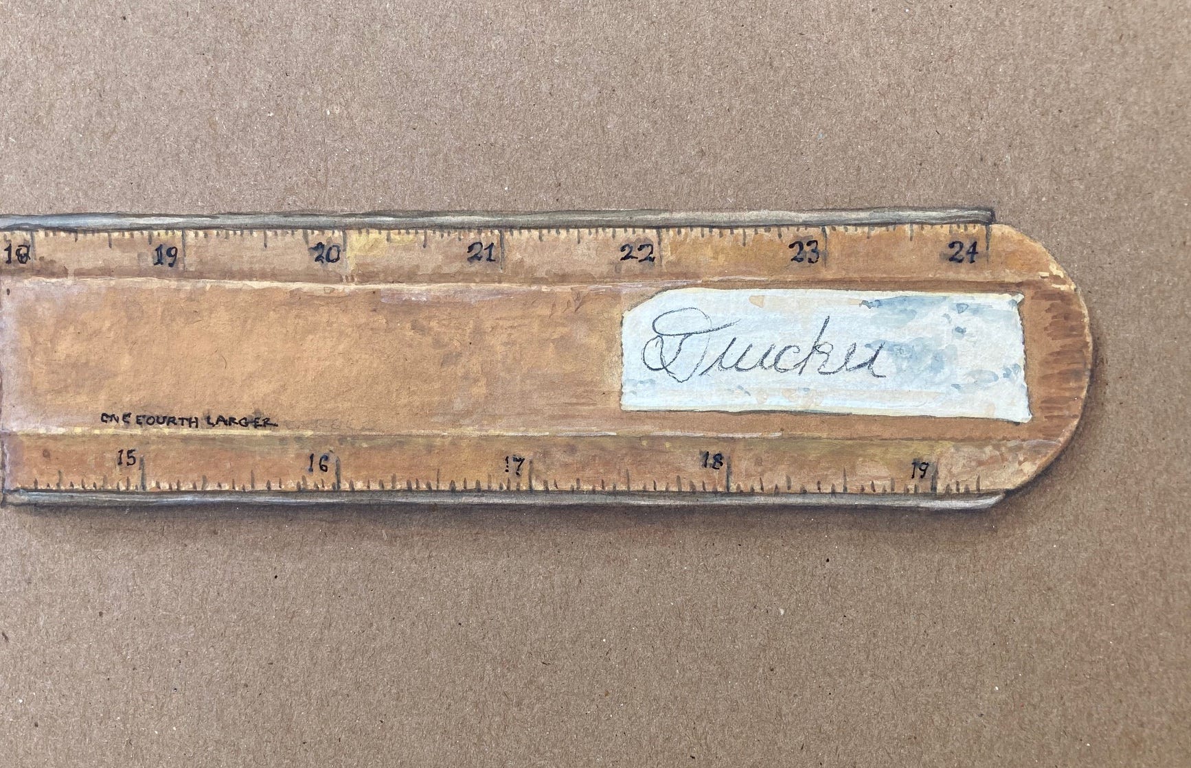
While I took a different route towards self-sufficiency, the allure of his studio practice sank in deep, and though my living came from other activities, graphic arts have been integral to my life across its full span. As my father aged and gradually de-accessioned his tools, a few came into my possession. Not as many as I might have liked, or would have kept, had I been able at the time, but still a handful of these objects that were the daily instruments of his trade remain. Among them is this amazing ruler, well-worn from so much use. The wear on its surface records his touch, and the masking-tape label that displays his name, written in a vigorous and generous script, is as present in this moment as ever in its decades of history. When was that signature made? More than half a century ago, at least, in a moment when he was no doubt sharing a studio space with others and thus felt the exigency of identifying his rulers in case they should travel to another desk or drawing board. The handwriting expresses the energy of a still-young man, confident, unhesitating, its open loops an indicator of a generous spirit.
His was a world of ink and gouache, liquids with various viscosities and opacities, of templates laid down using protractors, triangles, and other mechanical means of making shapes for organizing designs. All sat conveniently close to hand or were tacked onto a corkboard with hooks and then, later, as they became available, push pins. These humble objects all have their histories, as does the ruler. For instance, the earliest models of the push pin, invented by Edwin Moore just about 1900, were made of glass and steel, by hand, by him. He rented a room and worked through the night so he could deliver orders in the morning. Imagine. The familiar bright colored and clear plastic “pin with the handle” did not spring into popular use until the post-WW II boom in plastic manufacturing. But other tools have lineages dating further back. The oldest extant ruler is a copper alloy instrument found in the Sumerian city of Nippur by a German Assyriologist who dated it to about 2650 BCE. Standard units of measure are likely older given their importance in disputes about land, boundaries, property, and goods. Many, even most, early physical measures were based on the human body, as per the echoes in the word “foot” and size of an inch (first digit of the thumb), and cubit (elbow to the tip of the middle finger). The history of metrology (the science of measurement) is filled with fascinating details and novelties. One exercise I like to give to students in visual design is the creation of a unique metric from something analogue they can use as a standard. The results range from references to their bodies—length of stride, span of hand—to objects like a notebook, pen, or phone they can press into this novel role.
But my father’s ruler belongs to a specific period in graphic arts when the need to work at a variety of scales was supplied by physical tools. Some of us will recall the wheels used to figure proportion, gauging the percentage of increase or reduction required to shift an image from its original dimensions to its size for reproduction. Non-photo blue pencils left their scribbled instructions on the edge of back of a photo or image and were essential in the professional toolkit. So were X-acto cutting knives, the Logan matte knife, rapidograph pens and a wide array of markers. Like my father, I had—still have—such instruments ready to hand.
Now, this particular ruler is stamped “FITZIES Artists and Advertisers SCALER” and has four sets of proportional linear measures on its two sides. If you had no idea that such a thing existed, you might easily pick it up and make use of the “one fourth larger” without noticing it was off. The back side has the “one third larger” and “one half larger” scales in which the “inches” reach a final exaggeration that is apparent at a glance. The culturally acclimated and historically situated eye registers the peculiar distortion immediately. I know, viscerally, that I am in the realm of stretched metrics, and that marks stamped into the wooden edge are meant for a specialized purpose. And the fonts in the stamped lettering? The slab serif type is of an era in which it probably had a name like “Ritz” or “Clarendon.” Its beautiful curves and tear-drop endings to the strokes are mannered. They hark back to their 19th century roots in the foundries of Thorowgood and Besley in a London in which a bit of decorative flourish was seen as an advantage and sign of distinction. The Copperplate has an American pedigree, most likely, linked to that prolific and gifted scion of the Midwest, Indiana-born Frederic Goudy, whose designs the American Type Foundry first issued as this font in 1901.
But imagine using this ruler to redraw an image or plan to a new scale. What acts of transposition and careful attention would be needed to reduce or increase the size? What patience was required to make correlations across a host of drawn lines and letterforms? “Distributed by all artists supply dealers” claims the elegant copperplate type on what I think of as the “down” side of the rule, its wood still light and relatively clean by contrast to the much battered surface on the top. The wooden strip had been shaped, sent through a mill to bevel its outer edges on the top. The tick marks tilt down along the outer edge. Slim hard steel blades have been inserted into grooves on each of the long outer edges. These are for cutting, and protect the ruler from the blade of the knife, preventing it from becoming nicked and inaccurate. The blades sit just above the surface of the paper or board when the ruler is at rest, and therefore can also be used with a ruling pen, that arcane device of tapered, double metal jaws slowly drawing a line of a unwavering width from a well of fluid ink. If the ruler edge were flush to the surface, the ink would follow its own viscous attraction to the wood and smear mightily.
In other words, here is a precision-designed special-purpose instrument for a set of tasks no longer performed in analogue modes. The ruler can be used for normal purposes—drawing a line, taking a measure, cutting a straight edge and so its value has outlived its anachronistic origin. But its physical features are a testimony to a vanished world in which my father sat every day at a drawing table, his trays of tools beside him, able to reach for pen or brush, ink pot or palette, almost without thinking. The embodied knowledge and distributed cognition in his daily practice made these actions seamless, even if he glanced, time to time, to be sure his reach aimed in the right direction. My father’s drawing table is also in my possession, its wooden frame a simple device equipped with wing nut and slotted track to control the angle of the top. Its surface is inscribed with years’ worth of lines made by a knife and straight-edge drawn across the wood in a pattern that accreted from these daily habits of use.
I am struck by the conceptual richness of the multi-metric ruler. I regard its variable measures and reflect in each instance on which is the actual standard and which the distortion. Holding in mind the possibility that another scale can be as accurate to itself as the “normal” one exposes each as a convention, here stamped in ink on a strip of wood to be taken at face value. Or is that “faith value”? What systems of belief are embodied in this humble tool? The knowledge in my father’s hands and eyes was part of everything he did. He internalized these multiple metrics as guides to his graphic work as surely as he kept other values as guides to his behavior and decorum. The ruler suggests an ongoing dialogue, a constant negotiation between external, consensual standards and internal, private consideration. The visceral presence of this much-used object pulls at me. It registers not only my father’s absence, but his ability to read across scales–literally, metaphorically, non-dogmatically–in his daily practice and his life.
That last paragraph is truly beautiful ... the intermingling of one's mind, labor, and tools. Thank you for these gifts Johanna!
A beautifully rendered and affectionate meditation on an object, measurement of space and time, and one’s father. Its detail and metaphoric reach demonstrates the kind of careful, analogue consideration of (spatial and generational) scale you’re talking about. Thank you, Johanna!